Project Report: Mental Health Post COVID-19 Pandemic
Fei Xiao, Kelly Luo, Tongtong Zhu, Yi Fang, Yujie Huang
Motivation
Mental health is an important part of overall health and well-being. Mental health includes our emotional, psychological, and social well-being. Mental health problems exist frequently throughout the United States. About one in five adults suffer from a diagnosable mental illness in a given year. Many common mental illnesses, such as depression, anxiety, bipolar disorder, may increase risk of suicide.
Questions and Planned Analyses
- What is the general status of mental illness across states in the US?
- What is the overall trend of the percentage, frequency and level of anxiety and depression in the US across years?
- How do trends in anxiety and depression percentages differ by biological sex, household income, marital status, and age?
- What is the overall suicide trend across years? How does suicide differ by state, age, sex and means?
- What is the association between taking depression or anxious medication and COVID-19 exposure?
Data Source
IPUMS Health Surveys: NHIS is a harmonized set of data covering more than 50 years (1963-present) of the National Health Interview Survey (NHIS). The NHIS is the principal source of information on the health of the U.S. population, covering such topics as general health status, the distribution of acute and chronic illness, functional limitations, access to and use of medical services, insurance coverage, and health behaviors. On average, the survey covers 100,000 persons in 45,000 households each year. The IPUMS NHIS facilitates cross-time comparisons of these invaluable survey data by coding variables identically across time. Our analysis will use data from 2015 to 2021, which covers the COVID-19 period.
National Survey on Drug Use and Health (NSDUH): Substance Abuse and Mental Health Services Administration (SAMHSA), Center for Behavioral Health Statistics and Quality, National Survey on Drug Use and Health (NSDUH), 2019 and 2020.
Centers for Disease Control and Prevention (CDC): CDC WONDER online databases, deaths(2014-2020). Data were collected from the WONDER online databases under the category of the compressed mortality. National Center for Health Statistics, National Vital Statistics System, Mortality. Data were retrieved using NVSS multiple cause-of-death mortality files for 2000 through 2020. Suicide deaths were identified using International Classification of Diseases, 10th Revision (ICD–10) underlying cause-of-death codes U03, X60–X84, and Y87.0. Means of suicide were identified using ICD–10 codes X72–X74 for firearm, X60–X69 for poisoning, and X70 for suffocation. “Other means” includes: Cut or pierce; Drowning; Falls; Fire or flame; Other land transport; Struck by or against; Other specified, classifiable injury; Other specified, not elsewhere classified injury; and Unspecified injury, as classified by ICD–10.
Data Cleaning
Mental Illness Data
To understand the distribution of mental illness across states, we retrieved the mental illness data from the National Survey on Drug Use and Health (NSDUH),2019-2020. We focused on adults reporting any mental illness and adults reporting serious mental illness from 2019 to 2020. Number of adults reporting any mental illness and serious mental illness were rounded to the nearest 1,000. Serious mental illness (SMI) is defined as having a diagnosable mental, behavioral, or emotional disorder, other than a developmental or substance use disorder, as assessed by the Mental Health Surveillance Study (MHSS) Structured Clinical Interview for the Diagnostic and Statistical Manual of Mental Disorders. Estimates of SMI are a subset of estimates of any mental illness (AMI) because SMI is limited to people with AMI that resulted in serious functional impairment. The dataset included the mental illness data for 50 states and Washington D.C. The variables we focused were:
state: U.S. stateany_mental_num: number of adults reporting any mental illnessany_mental_per: percent of adults reporting any mental illnessser_mental_num: number of adults reporting serious mental illnessser_mental_per: percent of adults reporting serious mental illnessstate_abb: abbreviation of statesregion: state regions, including northeast, south, west and north central
mental_df =
  read_csv("./data/mental_data.csv") %>%
  janitor::clean_names() %>%
  mutate(
    any_mental_num = any_mental_num / 1000000,
    any_mental_per = any_mental_per * 100,
    ser_mental_num = ser_mental_num / 1000000,
    ser_mental_per = ser_mental_per * 100,
    state_abb = state.abb[match(state, state.name)],
    region = state.region[match(state, state.name)]
  ) %>%
  mutate(
    state_abb = replace(state_abb, state == "District of Columbia", "DC"))
Anxiety and Depression Data
We pulled out data from IPUMS Health Surveys: NHIS and will limit our analysis using data from 2015 to 2021. To analyze the trend of anxiety prevalence, frequency and level from 2015 to 2021, we will focus on anxiety indicators listed below:
WORFREQ:How often feel worried, nervous, or anxiousWORRX: Take medication for worried, nervous, or anxious feelingsWORFEELEVL: Level of worried, nervous, or anxious feelings, last time
To analyze the trend of depression prevalence, frequency and level from 2015 to 2021, we will focus on depression indicators listed below:
DEPRX:Take medication for depressionDEPFREQ:How often feel depressedDEPFEELEVL: Level of depression, last time depressed
Core demographic and Social economic status indicators listed below are also included in this analysis:
AGE:Age, individuals with age above 85 is excluded from analysis as 85 is the top code.SEX:Biological sexMARST:Current marital statusPOVERTY:Ratio of family income to poverty threshold
Responses indicate Unknown or not applied are excluded from our analysis.
anx_dep =
  read_csv("data/nhis_data01.csv") %>%
  janitor::clean_names() %>%
  filter(year>=2015) %>%
  select(year, worrx, worfreq, worfeelevl, deprx, depfreq, depfeelevl, age, sex, marst, poverty) %>%
  mutate(
    sex = recode_factor(sex,
                        "1" = "Male",
                        "2" = "Female"),
    marst = recode_factor(marst,
                        "10" = "Married", "11" = "Married", "12" = "Married", "13" = "Married",
                        "20" = "Widowed",
                        "30" = "Divorced",
                        "40" = "Separated",
                        "50" = "Never married"),
    poverty = recode_factor(poverty,
                        "11" = "Less than 1.0", "12" = "Less than 1.0",
                        "13" = "Less than 1.0", "14" = "Less than 1.0",
                        "21" = "1.0-2.0", "22" = "1.0-2.0",
                        "23" = "1.0-2.0", "24" = "1.0-2.0",
                        "25" = "1.0-2.0",
                        "31" = "2.0 and above","32" = "2.0 and above",
                        "33" = "2.0 and above","34" = "2.0 and above",
                        "35" = "2.0 and above","36" = "2.0 and above",
                        "37" = "2.0 and above","38" = "2.0 and above"),
    worrx = recode_factor(worrx,
                          '1' = "no",
                          '2' = "yes"),
    worfreq = recode_factor(worfreq,
                            '1' = "Daily",
                            '2' = "Weekly",
                            '3' = "Monthly",
                            '4' = "A few times a year",
                            '5' = "Never"),
    worfeelevl = recode_factor(worfeelevl,
                               '1' = "A lot",
                               '3' = "Somewhere between a little and a lot",
                               '2' = "A little"),
    deprx = recode_factor(deprx, '1' = "no", '2' = "yes"),
    depfreq = recode_factor(depfreq, '1' = "Daily", '2' = "Weekly",
                            '3' = "Monthly", '4' = "A few times a year",
                            '5' = "Never"),
    depfeelevl = recode_factor(depfeelevl, '1' = "A lot",
                               '3' = "Somewhere between a little and a lot",
                               '2' = "A little"),
    age = ifelse(age>=85, NA, age)
    )
Suicide Data
To understand the distribution of suicides across states, we retrieved the suicide data from the online CDC WONDER database,2014-2020. The suicide number is the number of per 100,000 population. The suicide rate is the suicide per 100,000 population. To analyze the overall trend of suicide in the US and the difference in suicide rate by age, gender, and means of suicide, we collected the suicide data from the National Vital Statistics System, Mortality. The age groups excluded the suicide number for people aged 5-9 years. Although suicides for those aged 5-9 years were included in total numbers, they were not included as a studied age group because of the small number of suicides per year in this age group. We focused on 20 years of suicide data from 2000 to 2020, and paid more attention to the changes in suicide trends in recent years (2018-2020). The key variables in the dataset were:
year: year, 2000-2020state: U.S. statesex: sex group, including female and maleage: age group, including 10-14, 15-24, 25-44, 45-64, 65-74, 75+suicide_no: number of suicide per 100,000 populationsuicide_100k: suicide rate (suicide per 100k)means: means of suicide, including firearm, poisoning, suffocation and others
suicide_df =
  read_excel(
    "./data/suicide_data.xlsx",
    sheet = 1,
    col_names = TRUE) %>%
  janitor::clean_names() %>%
  mutate(
    population = (suicide_no / suicide_100k) * 100000,
    sex = as.factor(sex),
    age = as.factor(age)
  )

average_20years = sum(suicide_df$suicide_no) / sum(suicide_df$population) * 100000

suicide_state_df =
  read_excel(
    "./data/suicide_data.xlsx",
    sheet = 2,
    range = "A1:D351",
    skip = 1,
    col_names = TRUE) %>%
  janitor::clean_names() %>%
  rename(
     suicide_no = deaths,
     suicide_100k = death_rate) %>%
  mutate(
    population = (suicide_no / suicide_100k) * 100000
  )

suicide_means_df =
   read_excel(
    "./data/suicide_data.xlsx",
    sheet = 3,
    col_names = TRUE) %>%
  janitor::clean_names() %>%
  pivot_longer(
    firearm:others,
    names_to = "means",
    values_to = "rate"
  ) %>%
  mutate(
       sex = as.factor(sex),
       means = as.factor(means))
Exploratory Analysis
Mental Illness
Map for Percent of Adults Reporting Any Mental Illness, by State between 2019-2020
According to the mental health data collected between 2019 -2020, the mental illness percents are high in the US overall, with variations between states. Among them, Utah has the highest rate of mental illness, 29.7%; Florida has the lowest rate of mental illness, 17.5%.
state_mental=
  plot_usmap(
    data = mental_df,
    regions = "state",
    values = "any_mental_per",
    labels = TRUE, label_color = "white") +
  labs(
    title = "Percent of adults reporting any mental illness for each state, 2019-2022"
  ) +
  scale_fill_continuous(
    name = "Mental illness percent (%)",
    label = scales::comma) +
  theme(
    legend.position = "right",
    plot.title = element_text(size = 12))

ggplotly(state_mental)
Any/Serious Mental Illness Numbers (Million), by Region between 2019-2020
Both any mental illness and serious mental illness are highest in the South, lowest in the Northeast. And the number of mental illness in the South is more than twice that of the Northeast.
any_mental_plot =
  mental_df %>%
    group_by(region) %>%
    drop_na() %>%
    summarize(any_mental_num = sum(any_mental_num)) %>%
    ggplot(
      aes(x = region, y = any_mental_num, fill = region)) +
    geom_bar(stat = "identity") +
    labs(
      title = "Any Mental Illness Number, by Region, 2019-2020",
      x = "Region",
      y = "Mental illness number (million)",
      fill = "Region") +
  theme(legend.position = "bottom")

ser_mental_plot =
  mental_df %>%
    group_by(region) %>%
    drop_na() %>%
    summarize(ser_mental_num = sum(ser_mental_num)) %>%
    ggplot(
      aes(x = region, y = ser_mental_num, fill = region)) +
    geom_bar(stat = "identity") +
    labs(
      title = "Serious Mental Illness Number, by Region, 2019-2020",
      x = "Region",
      y = "Mental illness number (million)",
      fill = "Region") +
    theme(legend.position = "bottom")

grid.arrange(any_mental_plot, ser_mental_plot, ncol =2) 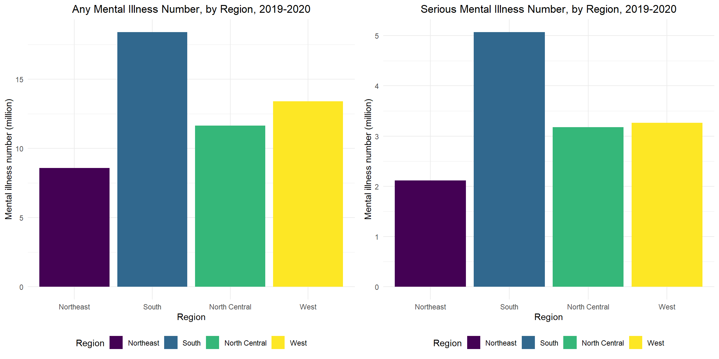
Any/Serious Mental Illness Percent, Top 10 States, 2019-2020
The top 10 states for any and serious mental illness are 8/10 the same, except Washington, Rhode Island, Arkansas and Indiana. Utah has the highest any/serious mental illness percent.
any_top10_plot =
  mental_df %>%
    filter(row_number(desc(any_mental_per)) <= 10) %>%
    mutate(
      state = fct_reorder(state, any_mental_per)
    ) %>%
    ggplot(
      aes(x = any_mental_per, y = state, fill = state)) +
      geom_bar(stat = "identity") +
      labs(
        title = "Any Mental Illness Percent, Top 10 States",
        x = "Any Mental illness percent (%)",
        y = "State",
        fill = "State") +
    theme(legend.position = "bottom")

ser_top10_plot =
  mental_df %>%
    filter(row_number(desc(ser_mental_per)) <= 10) %>%
    mutate(
      state = fct_reorder(state, ser_mental_per)
    ) %>%
    ggplot(
      aes(x = ser_mental_per, y = state, fill = state)) +
      geom_bar(stat = "identity") +
      labs(
        title = "Serious Mental Illness Percent, Top 10 States",
        x = "Serious mental illness percent (%)",
        y = "State",
      fill = "State") +
    theme(legend.position = "bottom")

grid.arrange(any_top10_plot, ser_top10_plot, ncol =2) 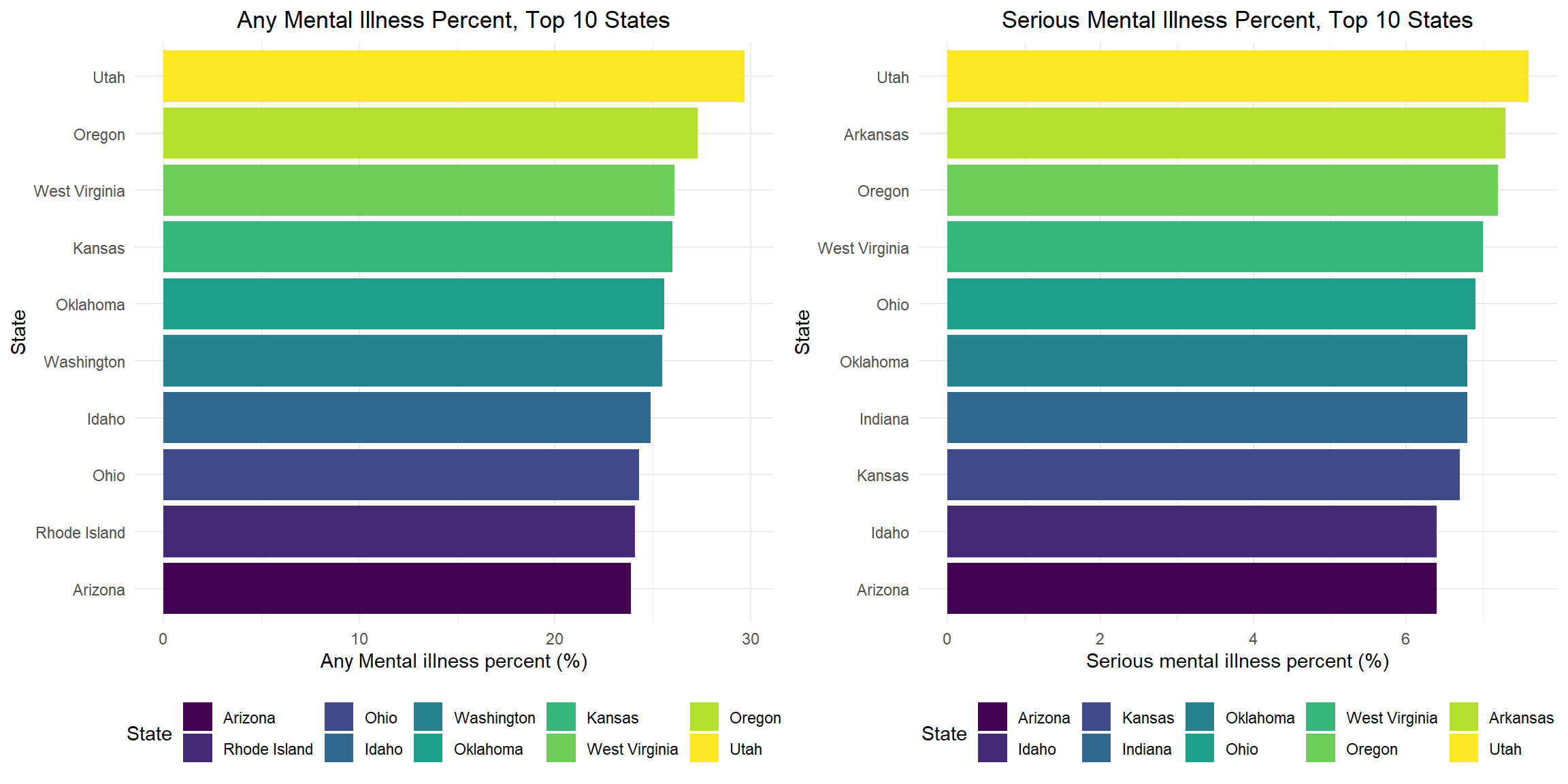
Anxiety
Percentage of People Reported Taken Medication for Worried, Nervous, or Anxious Feelings
According to the plot, from 2015 to 2021, the percentage of people who report taking medication for worry, stress or anxiety is constantly increasing from 9.13% in 2015 to 13.57% in 2021. We can observe a rapid increase from 2017 to 2019 and, contrary to our expectations, a relatively slow increase from 2019 to 2020. The effect of COVID-19 on anxiety percentage is not evident in this plot.
anx_dep %>%
  drop_na(worrx) %>%
  group_by(year, worrx) %>%
  summarize(wor_num = n()) %>%
  pivot_wider(
    names_from = worrx,
    values_from = wor_num
  ) %>%
  mutate(
    wor_percentage = yes/(no + yes)*100,
    text_label = str_c(yes, " out of ", no + yes)
  ) %>%
  ungroup() %>%
  plot_ly(
    y = ~wor_percentage,
    x = ~year,
    color = ~year,
    type = "bar",
    colors = "viridis",
    text = ~text_label
  ) %>%
  layout(
    title = "Percentage of people reported taken medication for anxiety",
    xaxis = list (title = ""),
    yaxis = list (title = "Percentage"),
    showlegend = FALSE
  ) %>%
  hide_colorbar()
Stratify by Biological Sex
Stratify the reported percentage of people taking medication for worried, nervous, or anxious feelings by biological sex, we can observe a much higher percentage among females than males. There is also a faster increase in the percentage among females from 14.41% in 2018 to 16.52% in 2019. Among males, the percentage is relatively stable from 2018 to 2020, while there is an increase from 2020 to 2021. Considering the fact that COVID-19 is prevalent in the United States starting in 2020, the effect of COVID-19 on anxiety percentage is not evident for either sex.
anx_dep %>%
  drop_na(sex, worrx) %>%
  group_by(sex, year, worrx) %>%
  summarize(wor_num = n()) %>%
  pivot_wider(
    names_from = worrx,
    values_from = wor_num
  ) %>%
  mutate(
    wor_percentage = yes/(no + yes)*100,
    text_label = str_c(yes, " out of ", no + yes)
  ) %>%
  ungroup() %>%
  plot_ly(
    y = ~wor_percentage,
    x = ~year,
    color = ~sex,
    type = "bar",
    colors = "viridis",
    text = ~text_label
  ) %>%
  add_trace(
    x = ~year,
    y = ~wor_percentage,
    color = ~sex,
    type='scatter',
    mode='lines+markers'
  ) %>%
  layout(
    title = "Percentage of people reported taken medication for anxiety, by biological sex",
    xaxis = list (title = ""),
    yaxis = list (title = "Percentage"),
    legend = list(orientation = 'h')
  )
Stratify by Ratio of Family Income to Poverty Threshold
Stratify the percentage of people reported taken medication for worried, nervous, or anxious feelings by the ratio of household income to the poverty line, we can clearly see that the lower the household income, the higher their percentage. The percentage among the lowest income stratum decreased rapidly from 17.30% in 2017 to 15.84% in 2018, which is the opposite of what happened in the other two strata. Although the percentage of the lowest income stratum decreased rapidly from 2017 to 2018, they still had the highest percentage of the three strata, and this decrease was followed by a rapid increase from 15.84% in 2018 to 18.58% in 2019. From 2020 to 2021, the percentage decreases for the other two strata, while for the highest-income stratum, the percentage steadily increases. Although household income appears to have an effect on anxiety, the effect of COVID-19 on anxiety is not evident for all three strata.
anx_dep %>%
  drop_na(poverty, worrx) %>%
  group_by(poverty, year, worrx) %>%
  summarize(wor_num = n()) %>%
  pivot_wider(
    names_from = worrx,
    values_from = wor_num
  ) %>%
  mutate(
    wor_percentage = yes/(no + yes)*100,
    text_label = str_c(yes, " out of ", no + yes)
  ) %>%
  ungroup() %>%
  plot_ly(
    y = ~wor_percentage,
    x = ~year,
    color = ~poverty,
    type = "scatter",
    mode = "lines+markers",
    colors = "viridis",
    text = ~text_label
  ) %>%
  layout(
    title = "Percentage of people reported taken medication for anxiety, by household income",
    xaxis = list (title = ""),
    yaxis = list (title = "Percentage"),
    legend = list(orientation = 'h')
  )
Stratify by Current Martial Status
Stratify the percentage of people reported taken medication for worried, nervous, or anxious feelings by current martial status, we can observe a rapid increase from 14.31% in 2019 to 17.49% in 2020 in those separated. Considering the timing, this could be an effect of COVID-19.For other strata, the effect of COVID-19 is not obvious.
anx_dep %>%
  drop_na(marst, worrx) %>%
  group_by(marst, year, worrx) %>%
  summarize(wor_num = n()) %>%
  pivot_wider(
    names_from = worrx,
    values_from = wor_num
  ) %>%
  mutate(
    wor_percentage = yes/(no + yes)*100,
    text_label = str_c(yes, " out of ", no + yes)
  ) %>%
  ungroup() %>%
  plot_ly(
    y = ~wor_percentage,
    x = ~year,
    color = ~marst,
    type = "scatter",
    mode='lines+markers',
    colors = "viridis",
    text = ~text_label
  ) %>%
  layout(
    title = "Percentage of people reported taken medication for anxiety, by martial status",
    xaxis = list (title = ""),
    yaxis = list (title = "Percentage"),
    legend = list(orientation = 'h')
  )
Age Distribution
As we can see from the plot, the age distribution of people taking medication for worried, nervous, or anxious feelings did not change much from 2015 to 2021. The effect of COVID-19 was not evident in this plot.
anxiety_age_plot =
  anx_dep %>%
  drop_na(age, worrx) %>%
  ggplot(
    aes(x=age, group=worrx, fill=worrx)
  ) +
  geom_density(alpha=0.4) +
  facet_wrap(~year) +
  labs(
    title = "Age distribution of whether reported taken medication for anxiety",
    fill = "Whether taken medicine for anxiety"
  )

ggplotly(anxiety_age_plot) %>%
  layout(legend = list(orientation = "h"))
Frequency of Worried, Nervous, or Anxious Feelings
From this bar plot about how often people feel worried, nervous, or anxious, we can observe that the frequency is steadily increasing from 2015 to 2021. There is also a rapid increase from 2019 to 2020, which could be COVID-19 related.
anx_dep %>%
  drop_na(worfreq) %>%
  group_by(year, worfreq) %>%
  summarize(count = n()) %>%
  group_by(year) %>%
  summarize(
     percentage=100 * count/sum(count),
     sum_count = sum(count),
     worfreq = worfreq,
     count=count
  ) %>%
  mutate(
    text_label = str_c(count, " out of ", sum_count)
  ) %>%
  plot_ly(
    y = ~percentage,
    x = ~year,
    color = ~worfreq,
    type = "bar",
    colors = "viridis",
    text = ~text_label
  ) %>%
  layout(
    title = "Frequency of anxiety",
    xaxis = list (title = ""),
    yaxis = list (title = "Percentage"),
    barmode = 'stack',
    legend = list(orientation = 'h')
  )
Level of Worried, Nervous, or Anxious Feelings
From this bar plot about the level of worried, nervous, or anxious feelings people felt last time, we can observe a relatively large increase from 2018 to 2019 in the percentage of people who felt worried, stressed, or anxious a lot or between a little and a lot. However, the distribution did not change much from 2019 to 2020, which indicates that the impact of COVID-19 on level of anxiety may not be significant.
anx_dep %>%
  drop_na(worfeelevl) %>%
  group_by(year, worfeelevl) %>%
  summarize(count = n()) %>%
  group_by(year) %>%
  summarize(
     percentage=100 * count/sum(count),
     sum_count = sum(count),
     worfeelevl = worfeelevl,
     count=count
  ) %>%
  mutate(
    text_label = str_c(count, " out of ", sum_count)
  ) %>%
  plot_ly(
    y = ~percentage,
    x = ~year,
    color = ~worfeelevl,
    type = "bar",
    colors = "viridis",
    text = ~text_label
  ) %>%
  layout(
    title = "Level of anxiety",
    xaxis = list (title = ""),
    yaxis = list (title = "Percentage"),
    barmode = 'stack',
    legend = list(orientation = 'h')
  )
Summary
- Contrary to our expectation, the association between COVID-19 and anxiety may not be significant from the plots.
- There is no major change in the trend of anxiety from 2019 to 2020.
- The increase in anxiety actually occurred prior to the COVID-19 period.
- Other factors such as biological sex and household income seem to have an greater impact on anxiety.
Depression
Percentage of People Reported Taken Medication for Depression
According to the plot, the proportion of people reported taken medication for depression increased from 8.75% in 2015 to 11.42% in 2020, followed by a slight decrease from 2020 to 2021. COVID-19 appears to have a limited impact on depression percentage.
anx_dep %>%
  drop_na(deprx) %>%
  group_by(year, deprx) %>%
  summarize(dep_num = n()) %>%
  pivot_wider(
    names_from = deprx,
    values_from = dep_num
  ) %>%
  mutate(
    dep_percentage = yes/(no + yes)*100,
    text_label = str_c(yes, " out of ", no + yes)
  ) %>%
  ungroup() %>%
  plot_ly(
    y = ~dep_percentage,
    x = ~year,
    color = ~year,
    type = "bar",
    colors = "viridis",
    text = ~text_label
  ) %>%
  layout(
    title = "Percentage of people reported taken medication for depression",
    xaxis = list (title = ""),
    yaxis = list (title = "Percentage"),
    showlegend = FALSE
  ) %>%
  hide_colorbar()
Stratify by Biological Sex
Stratify the reported percentage of people taking medication for depression by biological sex, we can observe a much higher percentage among females than males. There are also a faster increase in the percentage among females from 12.68% in 2017 to 15.14% in 2020 and a decrease from 15.14% in 2020 to 14.52% in 2021. Contrary to females, the percentage slightly decreased from 2018 to 2019 and then increased from 2020 to 2021 among males. The effect of COVID-19 is not evident fro either sex from this plot.
anx_dep %>%
  drop_na(sex, deprx) %>%
  group_by(sex, year, deprx) %>%
  summarize(dep_num = n()) %>%
  pivot_wider(
    names_from = deprx,
    values_from = dep_num
  ) %>%
  mutate(
    dep_percentage = yes/(no + yes)*100,
    text_label = str_c(yes, " out of ", no + yes)
  ) %>%
  ungroup() %>%
  plot_ly(
    y = ~dep_percentage,
    x = ~year,
    color = ~sex,
    type = "bar",
    colors = "viridis",
    text = ~text_label
  ) %>%
  add_trace(
    x = ~year,
    y = ~dep_percentage,
    color = ~sex,
    type='scatter',
    mode='lines+markers'
  ) %>%
  layout(
    title = "Percentage of people reported taken medication for depression, by biological sex",
    xaxis = list (title = ""),
    yaxis = list (title = "Percentage"),
    legend = list(orientation = 'h')
  )
Stratify by Ratio of Family Income to Poverty Threshold
Stratify the percentage of people reported taken medication for depression by the ratio of household income to the poverty line, we can clearly see that the lower the household income, the higher their percentage. The percentage among the lowest-income stratum decreased from 17.41% in 2017 to 16.53% in 2018, which is the opposite of what happened in the other two strata. The change in the percentage is quite stable from 2018 to 2019 among all three strata. There is a rapid increase from 17.02% in 2019 to 18.66% in 2020, which may indicate that people belonging to the lowest-income stratum are affected by COVID-19 related depression. For other two strata, the effect of COVID-19 is not evident.
anx_dep %>%
  drop_na(poverty, deprx) %>%
  group_by(poverty, year, deprx) %>%
  summarize(dep_num = n()) %>%
  pivot_wider(
    names_from = deprx,
    values_from = dep_num
  ) %>%
  mutate(
    dep_percentage = yes/(no + yes)*100,
    text_label = str_c(yes, " out of ", no + yes)
  ) %>%
  ungroup() %>%
  plot_ly(
    y = ~dep_percentage,
    x = ~year,
    color = ~poverty,
    type = "scatter",
    mode = "lines+markers",
    colors = "viridis",
    text = ~text_label
  ) %>%
  layout(
    title = "Percentage of people reported taken medication for depression, by household income",
    xaxis = list (title = ""),
    yaxis = list (title = "Percentage"),
    legend = list(orientation = 'h')
  )
Stratify by Current Martial Status
Stratify the percentage of people reported taken medication for depression by current martial status, we can observe a rapid decrease from 17.26% in 2016 to 13.12% in 2019 among separated, while this downward trend slows from 2018 to 2019 and reverses from 2019 to 2020. This reversal may be associated with COVID-19. The trends are similar for married and never married, divorced and widowed. The effect of COVID-19 is not evident for these three strata.
anx_dep %>%
  drop_na(marst, deprx) %>%
  group_by(marst, year, deprx) %>%
  summarize(dep_num = n()) %>%
  pivot_wider(
    names_from = deprx,
    values_from = dep_num
  ) %>%
  mutate(
    dep_percentage = yes/(no + yes)*100,
    text_label = str_c(yes, " out of ", no + yes)
  ) %>%
  ungroup() %>%
  plot_ly(
    y = ~dep_percentage,
    x = ~year,
    color = ~marst,
    type = "scatter",
    mode='lines+markers',
    colors = "viridis",
    text = ~text_label
  ) %>%
  layout(
    title = "Percentage of people reported taken medication for depression, by martial status",
    xaxis = list (title = ""),
    yaxis = list (title = "Percentage"),
    legend = list(orientation = 'h')
  )
Age Distribution
As we can see from the graph, people in their 60s tend to have a higher incidence of depression. However, the age distribution of people taking medication for depression did not change much from 2015 to 2021. The effect of COVID-19 is not evident in this plot.
depression_age_plot =
  anx_dep %>%
  drop_na(age, deprx) %>%
  ggplot(
    aes(x=age, group=deprx, fill=deprx)
  ) +
  geom_density(alpha=0.4) +
  facet_wrap(~year) +
  labs(
    title = "Age distribution of whether reported taken medication for depression",
    fill = "Whether taken medicine for depression"
  )

ggplotly(depression_age_plot) %>%
  layout(legend = list(orientation = "h"))
Frequency of Depression
From this bar plot about how often people feel depressed, we can observe that the frequency is quite stable and there is no clear evidence of the effect of COVID-19 on the frequency of depression.
anx_dep %>%
  drop_na(depfreq) %>%
  group_by(year, depfreq) %>%
  summarize(count = n()) %>%
  group_by(year) %>%
  summarize(
     percentage=100 * count/sum(count),
     sum_count = sum(count),
     depfreq = depfreq,
     count=count
  ) %>%
  mutate(
    text_label = str_c(count, " out of ", sum_count)
  ) %>%
  plot_ly(
    y = ~percentage,
    x = ~year,
    color = ~depfreq,
    type = "bar",
    colors = "viridis",
    text = ~text_label
  ) %>%
  layout(
    title = "Frequency of depression",
    xaxis = list (title = ""),
    yaxis = list (title = "Percentage"),
    barmode = 'stack',
    legend = list(orientation = 'h')
  )
Level of Depression
From this bar plot about the level of depression last time, we can see that the percentage of people who felt “a lot” or “between a little and a lot depression” is stable over the time period and a decrease of percentage of people feel “a lot depression” from 2018 to 2019. There is also no clear evidence of the effect of COVID-19 on the level of depression.
anx_dep %>%
  drop_na(depfeelevl) %>%
  group_by(year, depfeelevl) %>%
  summarize(count = n()) %>%
  group_by(year) %>%
  summarize(
     percentage=100 * count/sum(count),
     sum_count = sum(count),
     depfeelevl = depfeelevl,
     count=count
  ) %>%
  mutate(
    text_label = str_c(count, " out of ", sum_count)
  ) %>%
  plot_ly(
    y = ~percentage,
    x = ~year,
    color = ~depfeelevl,
    type = "bar",
    colors = "viridis",
    text = ~text_label
  ) %>%
  layout(
    title = "Level of depression",
    xaxis = list (title = ""),
    yaxis = list (title = "Percentage"),
    barmode = 'stack',
    legend = list(orientation = 'h')
  )
Summary
- Contrary to our expectation, the association between COVID-19 and depression may not be significant from the plots.
- From 2019 to 2020, there is no major change in the trend of depression.
- Other factors such as biological sex and household income seem to have an greater impact on depression.
Suicide
National Trend of Suicide Rate, 2000-2020, (per 100K, per year)
The US national suicide rates increase from 2000 to 2018, then decline from 2018 to 2020. The average suicide rate from 2000 to 2020 is 14.2 per 100,000 (represented with red dot line).
suicide_plot = suicide_df %>%
  group_by(year) %>%
  summarize(
    population = sum(population),
    suicide = sum(suicide_no),
    suicide_100k = (suicide / population) * 100000
  ) %>%
  ggplot(aes(x = year, y = suicide_100k)) +
  geom_line(col = "deepskyblue", size = 1) +
  geom_point(col = "deepskyblue", size = 2) +
  geom_hline(
    yintercept = average_20years, linetype = 2, color = "red", size = 1) +
  scale_x_continuous(breaks = seq(2000, 2020, 5)) +
  scale_y_continuous(breaks = seq(8, 18, 1)) +
  labs(title = "US National Suicide Rate (per 100K), 2000-2020",
       x = "Year",
       y = "Suicides per 100k")

ggplotly(suicide_plot)
Cumulative Suicide Rate for Each State, 2014-2020
Wyoming has the highest suicide rate and New Jersey has the lowest suicide rate from 2014-2020. The top 5 states with high cumulative suicide rates are Wyoming, Alaska, Montana, New Mexico, and Idaho; the top 5 states with low cumulative suicide rates are New Jersey, New York, Massachusetts, Maryland and Connecticut.
suicide_state_df %>%
  group_by(state) %>%
  summarize(
    population = sum(population),
    suicide = sum(suicide_no),
    suicide_100k = (suicide / population) * 100000
  ) %>%
  mutate(
    state = fct_reorder(state, suicide_100k)) %>%
  ggplot(aes(x = suicide_100k, y = state, fill = state )) +
  geom_bar(stat = "identity") +
  scale_x_continuous(breaks = seq(0, 30, 2)) +
  labs(
    title = "Cumulative Suicide Rate, by State, 2014-2020",
    x = "Suicides per 100k",
    y = "State") +
  theme(legend.position = "right")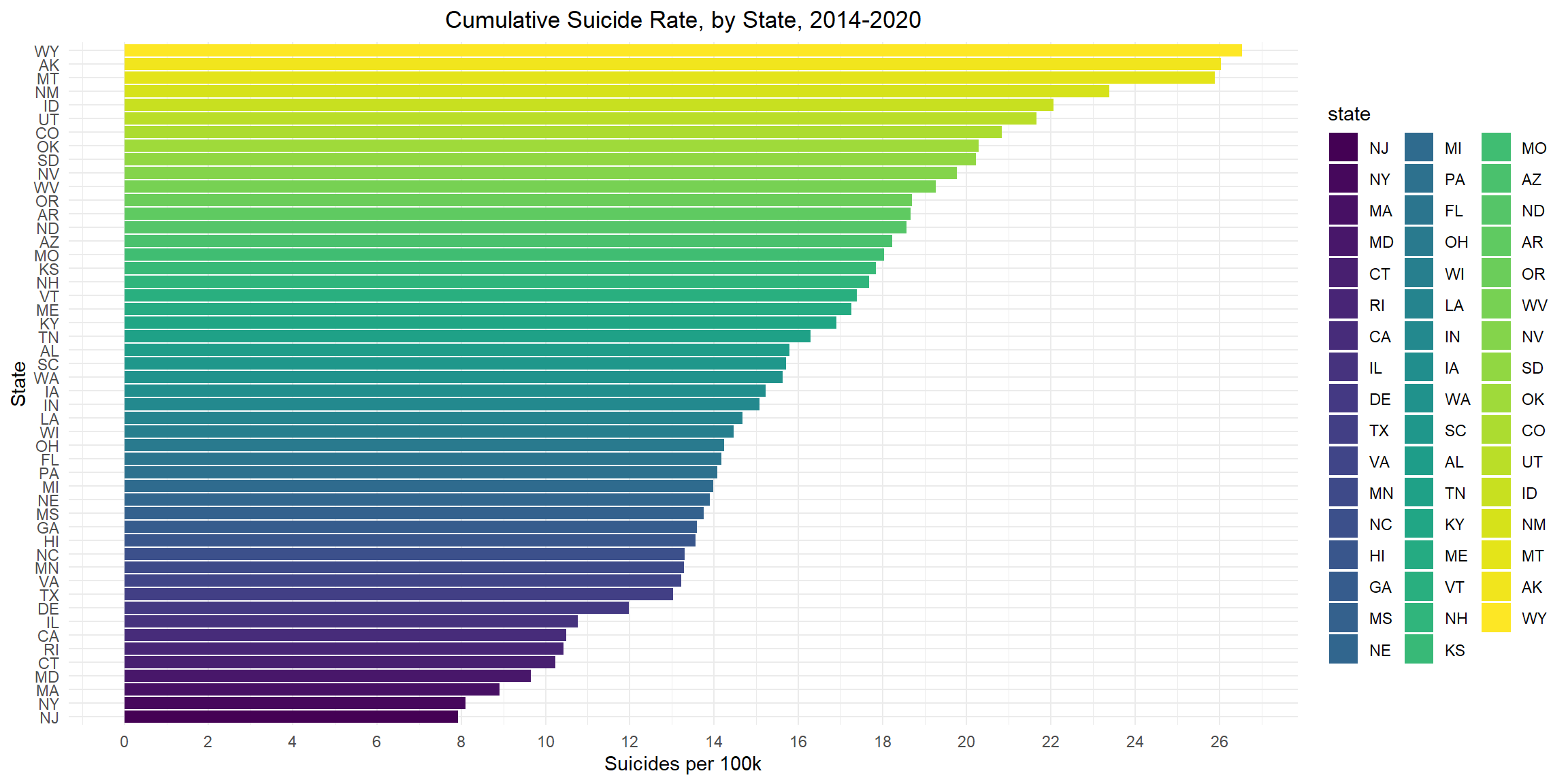
Suicide Rate for Each State over Years, 2014-2020
Between 2014 and 2020, the state with the largest change in suicide rate is Wyoming, from 20.6 to 30.5; the state with the smallest change in suicide rate is New York, from 7.8 to 8.3.
suicide_state_df %>%
  ggplot(aes(x = suicide_100k, y = state, color = year)) +
  geom_line(size = 1) +
  geom_point(size = 2) +
  labs(
    title = "Suicide Rate for Each State Over Years, 2014-2020",
    x = "State",
    y = "Suicides per 100K") +
  theme(legend.position = "right")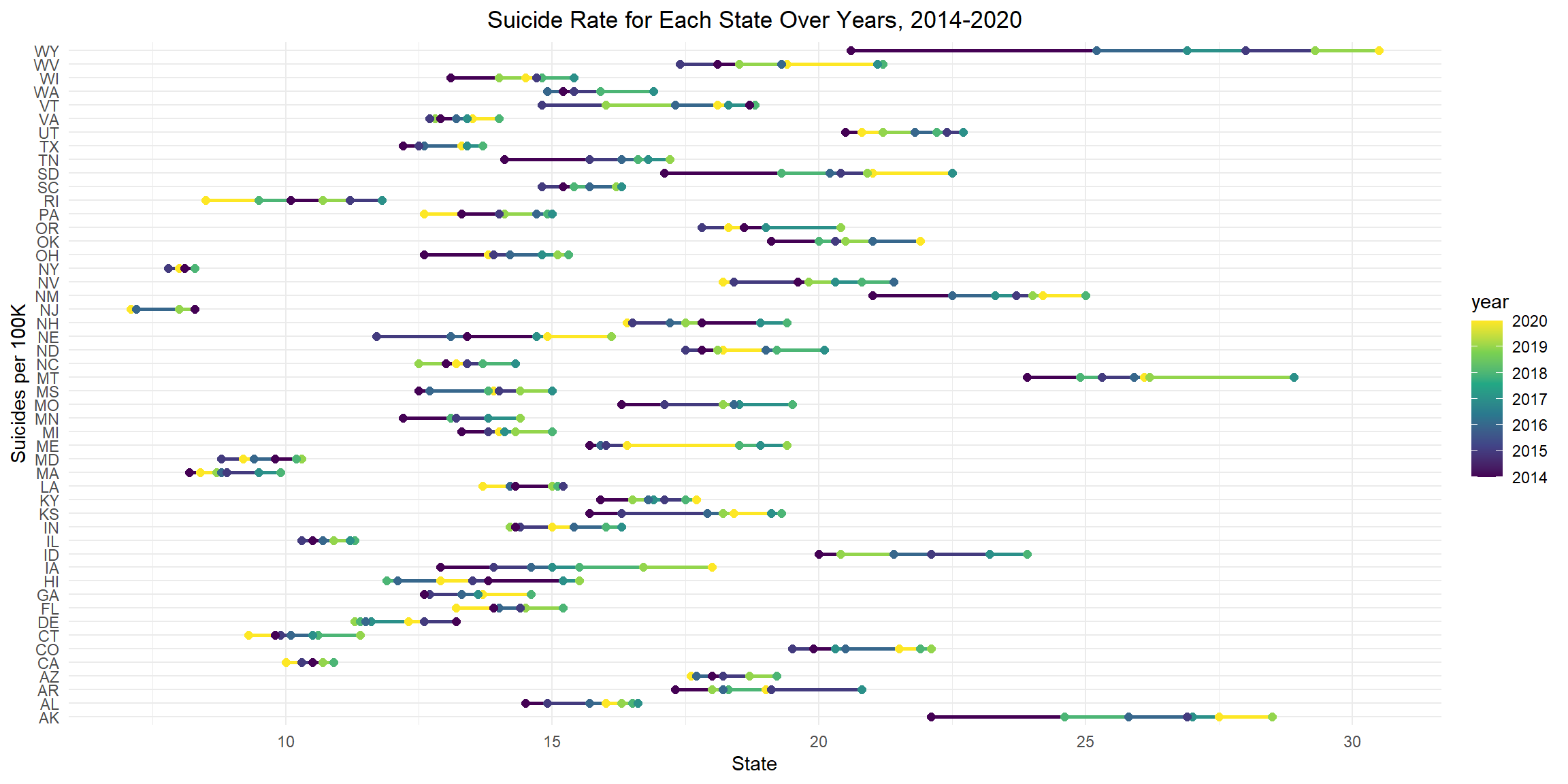
Suicide Rate by Sex
Nationally, the overall suicide rate for males is about 4 times that of females. For females, suicide rates peak in 2018 and decline since then; for males, suicide rates peak in 2017 and decline since then. From year 2000 to 2020, the male suicide rate remains apparently higher than the female suicide rate, and the ratio is constantly about 4:1.
total_sex_plot = suicide_df %>%
  group_by(sex) %>%
  summarize(
    population = sum(population),
    suicide = sum(suicide_no),
    suicide_100k = (suicide / population) * 100000
  ) %>%
  ggplot(aes(x = sex, y = suicide_100k, fill = sex )) +
  geom_bar(stat = "identity") +
  scale_y_continuous(breaks = seq(0, 24, 4)) +
  labs(
    title = "National Suicide Rate, by Sex",
    x = "Sex",
    y = "Suicides per 100k")


year_sex_plot = suicide_df %>%
  group_by(year, sex) %>%
  summarize(
    population = sum(population),
    suicide = sum(suicide_no),
    suicide_100k = (suicide / population) * 100000
  ) %>%
  ggplot(aes(x = year, y = suicide_100k, color = sex)) +
  geom_line(size = 1) +
  geom_point(size = 2) +
  scale_y_continuous(breaks = seq(0, 30, 5)) +
  labs(
    title = "Suicide Trend Over Years, by Sex",
    x = "Year",
    y = "Suicides per 100k"
  )

grid.arrange(total_sex_plot, year_sex_plot, ncol = 2 )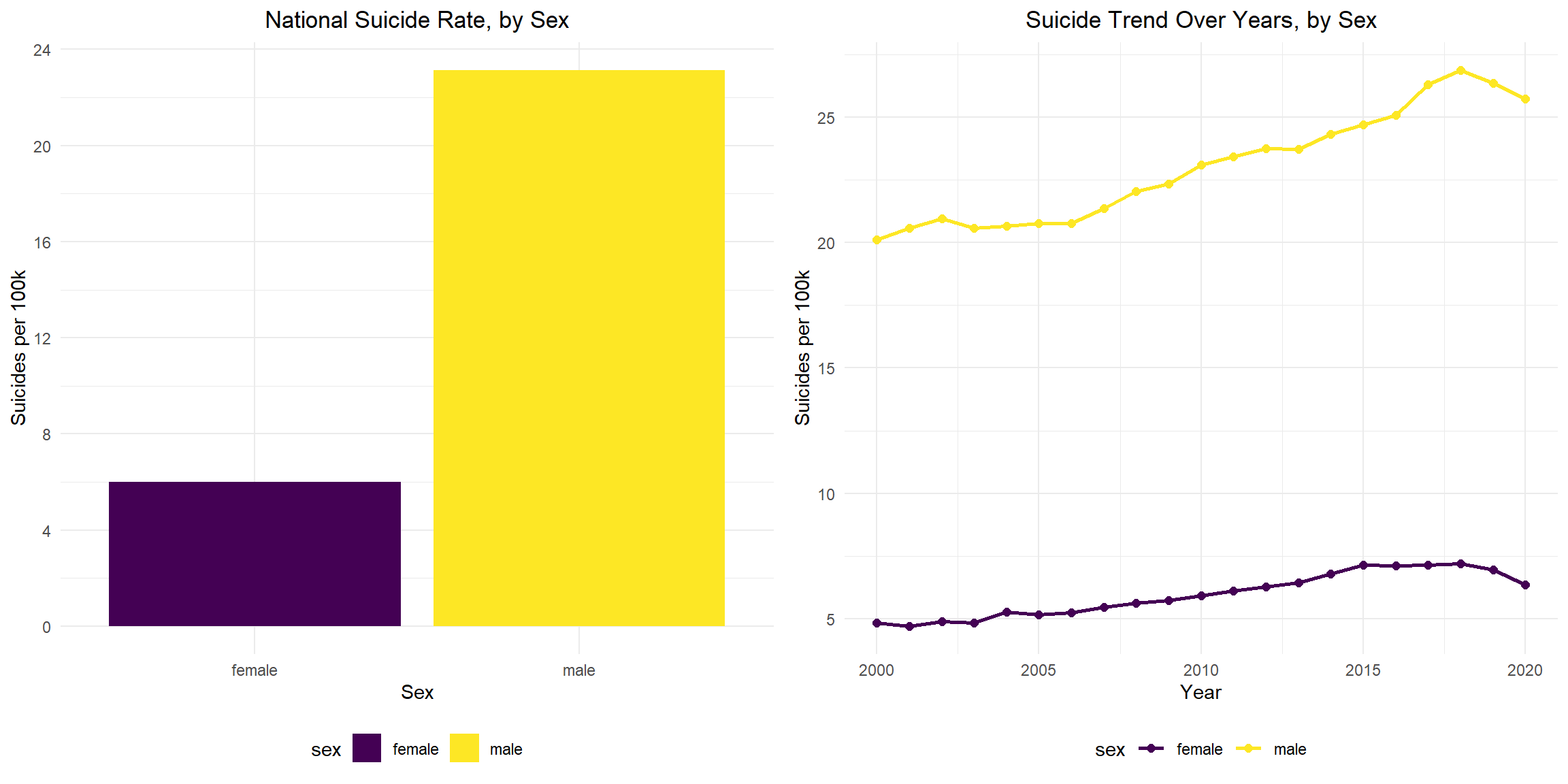
Suicide Rate by Age
Nationally, aged 45-64 had the highest suicide rate, second highest group is aged 75+. The 10-14 aged group has the lowest suicide rate. From year 2000 to 2020, the suicide rate of group aged 10-14 remains roughly static and small. Suicide rates in all other age groups show an overall upward trend. Among them, the group aged 25-44 has the largest change, roughly from 10 to 18 suicide rate per 100k. The suicide rates of those aged 45-64 and aged 65-74 start to drop since 2018.
total_age_plot = suicide_df %>%
  group_by(age) %>%
  summarize(
    population = sum(population),
    suicide = sum(suicide_no),
    suicide_100k = (suicide / population) * 100000
  ) %>%
  ggplot(aes(x = age, y = suicide_100k, fill = age )) +
  geom_bar(stat = "identity") +
  scale_y_continuous(breaks = seq(0, 20, 2)) +
  labs(
    title = "National Suicide Rate, by Age",
    x = "Age",
    y = "Suicides per 100k")


year_age_plot = suicide_df %>%
  group_by(year, age) %>%
  summarize(
    population = sum(population),
    suicide = sum(suicide_no),
    suicide_100k = (suicide / population) * 100000
  ) %>%
  ggplot(aes(x = year, y = suicide_100k,  color = age)) +
  geom_line(size = 1) +
  geom_point(size = 2) +
  scale_y_continuous(breaks = seq(0, 24, 2)) +
  labs(
    title = "Suicide Trend Over Years, by Age",
    x = "Year",
    y = "Suicides per 100k"
  )

grid.arrange(total_age_plot, year_age_plot, ncol = 2 )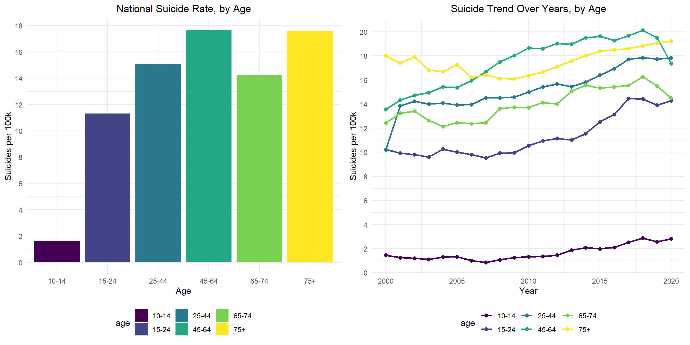
Suicide Rate for Females, by Age Group, 2000-2020
Recently (from 2018 to 2020), suicide rates decrease in females aged 25-44, 45-64, 65-74 and 75+, but increase for those aged 15-24 and keep constant for those aged 10-14. Suicide rates are highest for those females aged 45-64 over the period of 2000-2020. The suicide rates increase from 6.2 in 2000 to the highest 10.2 in 2015, and then decline to 7.9 in 2020. Suicide rates are consistently lowest for those females aged 10-14 over the period of 2000-2020. The suicide rates increase from 0.6 in 2000 to the highest 2.0 in 2018, and then keep constant through 2020.But the rate more than triples from 0.6 (2000) to 2.0 (2020). The suicide rates of those aged 75+ are relatively stable between 2000 and 2020.
female_plot = suicide_df %>%
  filter(sex == "female") %>%
  group_by(year, age) %>%
  summarize(
    population = sum(population),
    suicide = sum(suicide_no),
    suicide_100k = (suicide / population) * 100000
  ) %>%
  ggplot(aes(x = year, y = suicide_100k,  color = age)) +
  geom_line(size = 1) +
  geom_point(size = 2) +
  scale_y_continuous(breaks = seq(0, 12, 2)) +
  labs(
    title = "Suicide Trend  for Females by Age, 2000-2020",
    x = "Year",
    y = "Suicides per 100k"
  )

ggplotly(female_plot)
Suicide Rate for Males, by Age Group, 2000-2020
Recently (from 2018 to 2020), suicide rates decrease in males aged 45-64 and 65-74, but increase for those aged 10-14, 15-24, 25-44 and 75+. Suicide rates are consistently highest for those males aged 75+ over the period of 2000-2020. The suicide rate decline from highest 42.4 in 2000 to the lowest 35.6 in 2009, and then increase to 40.5 in 2020. Suicide rates are consistently lowest for those males aged 10-14 over the period of 2000-2020. The suicide rate declines from 2.3 in 2000 to 1.2 in 2007, and then increase to 3.6 in 2020. The suicide rates of those aged 10-14 are relatively stable between 2000 and 2020.
male_plot =  suicide_df %>%
  filter(sex == "male") %>%
  group_by(year, age) %>%
  summarize(
    population = sum(population),
    suicide = sum(suicide_no),
    suicide_100k = (suicide / population) * 100000
  ) %>%
  ggplot(aes(x = year, y = suicide_100k,  color = age)) +
  geom_line(size = 1) +
  geom_point(size = 2) +
  scale_y_continuous(breaks = seq(0, 45, 5)) +
  labs(
    title = "Suicide Trend  for Males by Age, 2000-2020",
    x = "Year",
    y = "Suicides per 100k"
  )

ggplotly(male_plot)
Suicide Rate for Females, by Means of Suicide, 2000-2020
For females, the rates for firearm-related suicide increase from 1.4 in 2008 to 1.9 in 2016 and remain stable through 2020. Suicides by firearm become the leading means for females in 2020. The rates for poisoning-related suicide increase from 1.4 in 2000 to 2.0 in 2015 and decline to 1.5 in 2020. Before 2016, poisoning-related suicides are the leading means for females. The rates for suffocation-related suicides dramatically increase from 0.7 in 2000 to 1.9 in 2018, and then decline slightly to 1.7 in 2020. Overall, the rates are more than doubled over the study period. During the study period, differences in rates for suicide by firearm, poisoning and suffocation decline. In 2020, females have the highest rate for firearm suicide (1.8), followed by suffocation (1.7) and poisoning (1.5).
female_means_plot = suicide_means_df %>%
  filter(sex == "female") %>%
  ggplot(aes(x = year, y = rate,  color = means)) +
  geom_line(size = 1) +
  geom_point(size = 2) +
  scale_y_continuous(breaks = seq(0, 2.5, 0.5)) +
  labs(
    title = "Female Suicide Rates, by Means of Suicide, 2000-2020",
    x = "Year",
    y = "Suicides per 100k"
  )

ggplotly(female_means_plot)
Suicide Rate for Males, by Means of Suicide, 2000-2020
For males, the rates for firearm-related suicide decline from 11.0 in 2000 to 10.3 in 2006 and then increase to 12.5 in 2020. The rates for firearm-related suicide are much higher than that for all other suicide means (poisoning, suffocation and others). Overall, the rates for poisoning-related suicide decline from 2.1 in 2000 to 1.7 in 2020. And the rates remain in a relatively low level. The rates for suffocation-related suicides increase from 3.4 in 2000 to 6.7 in 2018, and then decline to 6.1 in 2020. Overall, the rates are almost doubled during the study period. During the study period, the difference in rates for firearm-related suicide and suffocation-related suicide narrows, but the difference in rates for suffocation-related suicide and poisoning-related suicide widens. For the same suicide means, the rates for males are generally higher than that of females.
male_means_plot = suicide_means_df %>%
  filter(sex == "male") %>%
  ggplot(aes(x = year, y = rate,  color = means)) +
  geom_line(size = 1) +
  geom_point(size = 2) +
  scale_y_continuous(breaks = seq(0, 16, 2)) +
  labs(
    title = "Male Suicide Rates, by Means of Suicide, 2000-2020",
    x = "Year",
    y = "Suicides per 100k"
  )

ggplotly(male_means_plot)
Summary
- The US national suicide rates increase from 2000 to 2018, then decline from 2018 to 2020.
- The suicide rates are high in the US overall, with variations between states and over years. Wyoming has the highest suicide rate and New Jersey has the lowest suicide rate from 2014-2020.
- For both females and males, suicide rates are lower in 2020 than in 2018 and 2019. Overall, the suicide rate for males is much higher than that of females.
- Overall, suicide rates increase with age (except age group 65-74). Suicide rates in all age groups shown an upward trend.
- The leading means of suicide for females in 2020 is firearm-related, before 2017, poisoning-related is the leading means. The leading means of suicide for males is firearm-related over 20 years.
Regression
regression_df =
  read_csv("data/nhis_data01.csv") %>%
  janitor::clean_names() %>%
  filter(year == 2020) %>%
  select(worrx, deprx, age, sex, poverty, marst, cvddiag) %>%
  mutate(
    sex = recode_factor(sex,
                        "1" = "_Male",
                        "2" = "_Female"),
    marital_status = recode_factor(marst,
                        "10" = "_Married", "11" = "_Married","12" = "_Married","13" = "_Married",
                        "20" = "_Widowed","30" = "_Divorced","40" = "_Separated",
                        "50" = "_Never married"),
    poverty = recode_factor(poverty,
                        "11" = "_Less than 1.0", "12" = "_Less than 1.0",
                        "13" = "_Less than 1.0", "14" = "_Less than 1.0",
                        "21" = "_1.0-2.0", "22" = "_1.0-2.0",
                        "23" = "_1.0-2.0", "24" = "_1.0-2.0",
                        "25" = "_1.0-2.0",
                        "31" = "_2.0 and above","32" = "_2.0 and above",
                        "33" = "_2.0 and above","34" = "_2.0 and above",
                        "35" = "_2.0 and above","36" = "_2.0 and above",
                        "37" = "_2.0 and above","38" = "_2.0 and above"),
    age = ifelse(age>=85, NA, age),
    worrx = ifelse(worrx>=3, NA, worrx),
    deprx = ifelse(deprx>=3, NA, deprx),
    worrx = recode_factor(worrx,
                          '1' = 0,
                          '2' = 1),
    deprx = recode_factor(deprx, '1' = 0, '2' = 1),
    cvddiag = recode_factor(cvddiag,
                            "1" = "_Never had COVID-19",
                          "2" = "_Had COVID-19")
    ) %>%
  drop_na(age, worrx, deprx, sex, poverty, marital_status, cvddiag)
Worries and Anxiety
Whether taken medication for worried, nervous, or anxious feelings is associated with COVID-19 adjusting for age, sex, family income level and current marital status.
mosi_regression_df =
  read_csv("data/nhis_data01.csv") %>%
  janitor::clean_names() %>%
  filter(year == 2020) %>%
  select(worrx, deprx, age, sex, poverty, marst, cvddiag) %>%
  mutate(
    sex = recode_factor(sex,
                        "1" = "Male",
                        "2" = "Female"),
    marital_status = recode_factor(marst,
                        "10" = "Married", "11" = "Married","12" = "Married","13" = "Married",
                        "20" = "Widowed","30" = "Divorced","40" = "Separated",
                        "50" = "Never married"),
    poverty = recode_factor(poverty,
                        "11" = "Less than 1.0", "12" = "Less than 1.0",
                        "13" = "Less than 1.0", "14" = "Less than 1.0",
                        "21" = "1.0-2.0", "22" = "1.0-2.0",
                        "23" = "1.0-2.0", "24" = "1.0-2.0",
                        "25" = "1.0-2.0",
                        "31" = "2.0 and above","32" = "2.0 and above",
                        "33" = "2.0 and above","34" = "2.0 and above",
                        "35" = "2.0 and above","36" = "2.0 and above",
                        "37" = "2.0 and above","38" = "2.0 and above"),
    age = ifelse(age>=85, NA, age),
    worrx = ifelse(worrx>=3, NA, worrx),
    deprx = ifelse(deprx>=3, NA, deprx),
    worrx = recode_factor(worrx,
                          '1' = 'No',
                          '2' = 'Yes'),
    deprx = recode_factor(deprx, '1' = 'No', '2' = 'Yes'),
    cvddiag = recode_factor(cvddiag,
                            "1" = "Never had COVID-19",
                          "2" = "Had COVID-19")
    ) %>%
  drop_na(age, worrx, deprx, sex, poverty, marital_status, cvddiag)
Mosaic Plot
The Mosaic Plot included four categorical variables and it was used to visualize the proportional relationship between these variables and the outcome (whether or not taken medication for worried, nervous, or anxious feelings) in the population.
Based on the plot, we can observe that compared to the other three variables (sex, family income level, and current marital status), there was no obvious difference in the proportion of people who took medication for anxiety when comparing those who had COVID-19 with those who never had COVID-19. That is, having had COVID-19 or not had no significant effect on whether or not taking medication for anxiety in the population.
In truth, when comparing male with female, we can observe the largest difference in the proportion of people who took medication for anxiety. It means that among those four variables, the variable sex has the largest difference in the proportion of people who took medication for anxiety.
sex_worrx =
  mosi_regression_df %>%
  ggplot() +
  geom_mosaic(
    aes(
      x = product(worrx, sex),
      fill = worrx
    ),
    offset = 0.01,
    show.legend = FALSE
  )+
  labs(
    x="",
   y=""
  )+
  theme(
    axis.text.y = element_blank(),
    axis.ticks.y=element_blank(),
    axis.text.x = element_text(angle = 90, hjust = 1)
  )

poverty_worrx =
  mosi_regression_df %>%
  ggplot() +
  geom_mosaic(
    aes(
      x = product(worrx, poverty),
      fill = worrx
    ),
    offset = 0.01
  )+
  labs(
    x="",
    y="",
    fill = "Whether taken medicine for anxiety")+
  theme(
    axis.text.y = element_blank(),
    axis.ticks.y=element_blank(),
    axis.text.x = element_text(angle = 90, hjust = 1)
  )

marital_status_worrx =
  mosi_regression_df %>%
  ggplot() +
  geom_mosaic(
    aes(
      x = product(worrx, marital_status),
      fill = worrx
    ),
    offset = 0.01,
    show.legend = FALSE
  )+
  labs(
    x="",
    y=""
  )+
  theme(
    axis.text.y = element_blank(),
    axis.ticks.y=element_blank(),
    axis.text.x = element_text(angle = 90, hjust = 1)
  )

cvddiag_worrx =
  mosi_regression_df %>%
  ggplot() +
  geom_mosaic(
    aes(
      x = product(worrx, cvddiag),
      fill = worrx
    ),
    offset = 0.01,
    show.legend = FALSE
  )+
  labs(
    x="",
  y=""
  )+
  theme(
    axis.text.y = element_blank(),
    axis.ticks.y=element_blank(),
    axis.text.x = element_text(angle = 90, hjust = 1),
  )

sex_worrx = ggplotly(sex_worrx)

poverty_worrx =
  ggplotly(poverty_worrx) %>%
  layout(legend = list(orientation = "h"))

marital_status_worrx = ggplotly(marital_status_worrx)

cvddiag_worrx = ggplotly(cvddiag_worrx)

subplot(
  style(sex_worrx, showlegend = F),
  style(cvddiag_worrx, showlegend = F),
  style(marital_status_worrx, showlegend = F),
  poverty_worrx, nrows=1) %>%
  layout(legend = list(x = 0, y = -0.4))
Diagnostics
We seek to validate our models and assess its goodness of fit. In our motivating example, we have two models: (1) Crude model and (2) Adjusted model.
- The crude model only has the outcome ( Whether taking medication for worried, nervous, or anxious feelings = Yes/No) and the predictor of interest (COVID-19 Status).
- The adjusted model has the outcome and predictor of interest (COVID-19 Status) along with other with four covariates (Sex, Age, Poverty(family income level),and Current Marital Status).
We can assess which of these two models fit the data better using the likelihood ratio test.
anxiety_crude_model =
  glm(worrx ~ cvddiag, family=binomial(link='logit'),
                            data = regression_df)
anxiety_adjusted_model =
glm(worrx ~ sex + poverty + age + marital_status + cvddiag,
family=binomial(link='logit'),
data = regression_df)lrtest(anxiety_crude_model, anxiety_adjusted_model) %>%
kbl(caption = "Likelihood ratio test for crude model and adjusted model", col.names = c("Total df for each model", "LogLik", "difference in df", "Chisq-statistic", "p-value")) %>%
kable_paper("striped", full_width = F) %>%
column_spec(1, bold = T)| Total df for each model | LogLik | difference in df | Chisq-statistic | p-value |
|---|---|---|---|---|
| 2 | -6531.299 | NA | NA | NA |
| 10 | -6328.790 | 8 | 405.0173 | 0 |
- Goodness of Fit
- Likelihood ratio test: The resulting p-value is so small it’s very close to 0, so we can reject the null hypothesis. The p<0.00001 suggesting that the adjusted model with five covariates (Sex, Age, Poverty(family income level), Current Marital Status and COVID-19 Status) fits the data significantly better than the crude model.
Results
Since four of these main effects were categorical variables, so we need to create dummy variables that indicate which levels of the predictors a given individual belonged. The outcome for this logistic regression is binary (Whether taking medication for worried, nervous, or anxious feelings = Yes/No).
- The variable
Sexhas one dummy variable andSex_Maleis the reference group. - The variable
povertyhas two dummy variables andpoverty_less than 1.0is the reference group. - The variable
marital_statushas four dummy variables andmarital_status_Marriedis the reference group. - The variable
cvddiag(COVID-19 status)has one dummy variable andcvddiag_Had COVID-19is the reference group.
anxiety_adjusted_model %>%
   broom::tidy() %>%
  mutate(OR = exp(estimate),
         Lower_CI = exp(estimate -1.96*std.error),
         Upper_CI = exp(estimate +1.96*std.error)) %>%
  select(term, OR, Lower_CI, Upper_CI, statistic, p.value) %>%
  kbl(caption     = "Effect of Selected Predictors on whether taking medication for worried, nervous, or anxious feelings"
    , col.names   = c("Predictors", "OR", "Lower bound of 95% CI","Upper bound of 95% CI", "t-statistic", "p-value"),
    digits= 2) %>%
  kable_paper("striped", full_width = F) %>%
column_spec(1, bold = T)| Predictors | OR | Lower bound of 95% CI | Upper bound of 95% CI | t-statistic | p-value |
|---|---|---|---|---|---|
| (Intercept) | 0.11 | 0.09 | 0.14 | -18.20 | 0.00 |
| sex_Female | 2.32 | 2.10 | 2.55 | 16.74 | 0.00 |
| poverty_1.0-2.0 | 0.83 | 0.70 | 0.98 | -2.20 | 0.03 |
| poverty_2.0 and above | 0.68 | 0.59 | 0.79 | -5.14 | 0.00 |
| age | 1.00 | 1.00 | 1.00 | 0.42 | 0.68 |
| marital_status_Widowed | 1.04 | 0.87 | 1.23 | 0.41 | 0.68 |
| marital_status_Divorced | 1.40 | 1.24 | 1.59 | 5.33 | 0.00 |
| marital_status_Separated | 1.56 | 1.13 | 2.15 | 2.71 | 0.01 |
| marital_status_Never married | 1.12 | 0.98 | 1.27 | 1.72 | 0.09 |
| cvddiag_Had COVID-19 | 1.20 | 0.96 | 1.51 | 1.64 | 0.10 |
After adjustment for sex, age, poverty(family income level), and
Current Marital Status, we obtained the p-value for the
variable cvddiage(COVID-19 status)is 0.10 > α=0.05.
Hence, we find no statistically significant association between COVID-19
status and taking medication for worried, nervous, or anxious feelings
(aOR: 1.20, 95% CI: 0.96, 1.51). In addition, the findings in the
statistical analysis matches what we get in the anxiety trend section of
our exploratory analysis. Due to the Table 2 fallacy, we should avoid
interpreting covariates other than the exposure of interest, but they
are included here for completeness.
Depression
Whether taken medication for depression is associated with COVID-19 adjusting for age, sex, family income level and current marital status.
Mosaic Plot
The Mosaic Plot included four categorical variables and it was used to visualize the proportional relationship between these variables and the outcome (whether or not taken medication for depression) in the population.
Based on the plot, we can observe that compared to the other three variables (sex, family income level, and current marital status), there was no obvious difference in the proportion of people who took medication for depression when comparing those who had COVID-19 with those who never had COVID-19. That is, having had COVID-19 or not had no significant effect on whether or not taking medication for depression in the population.
In truth, when comparing male with female, we can observe the largest difference in the proportion of people who took medication for depression. It means that among those four variables, the variable sex has the largest difference in the proportion of people who took medication for depression.
sex_deprx =
  mosi_regression_df %>%
  ggplot() +
  geom_mosaic(
    aes(
      x = product(deprx, sex),
      fill = deprx
    ),
    offset = 0.01,
    show.legend = FALSE
  )+
  labs(
    x="",
   y=""
  )+
  theme(
    axis.text.y = element_blank(),
    axis.ticks.y=element_blank(),
    axis.text.x = element_text(angle = 90, hjust = 1)
  )

poverty_deprx =
 mosi_regression_df %>%
  ggplot() +
  geom_mosaic(
    aes(
      x = product(deprx, poverty),
      fill = deprx
    ),
    offset = 0.01
  )+
  labs(
    x="",
    y="",
    fill = "Whether taken medicine for depression")+
  theme(
    axis.text.y = element_blank(),
    axis.ticks.y=element_blank(),
    axis.text.x = element_text(angle = 90, hjust = 1)
  )

marital_status_deprx =
  mosi_regression_df %>%
  ggplot() +
  geom_mosaic(
    aes(
      x = product(deprx, marital_status),
      fill = deprx
    ),
    offset = 0.01,
    show.legend = FALSE
  )+
  labs(
    x="",
    y=""
  )+
  theme(
    axis.text.y = element_blank(),
    axis.ticks.y=element_blank(),
    axis.text.x = element_text(angle = 90, hjust = 1)
  )

cvddiag_deprx =
  mosi_regression_df %>%
  ggplot() +
  geom_mosaic(
    aes(
      x = product(deprx, cvddiag),
      fill = deprx
    ),
    offset = 0.01,
    show.legend = FALSE
  )+
  labs(
    x="",
  y=""
  )+
  theme(
    axis.text.y = element_blank(),
    axis.ticks.y=element_blank(),
    axis.text.x = element_text(angle = 90, hjust = 1),
  )

sex_deprx = ggplotly(sex_deprx)

poverty_deprx =
  ggplotly(poverty_deprx) %>%
  layout(legend = list(orientation = "h"))

marital_status_deprx = ggplotly(marital_status_deprx)

cvddiag_deprx = ggplotly(cvddiag_deprx)

subplot(
  style(sex_deprx, showlegend = F),
  style(cvddiag_deprx, showlegend = F),
  style(marital_status_deprx, showlegend = F),
  poverty_deprx, nrows=1) %>%
  layout(legend = list(x = 0, y = -0.4))
Diagnostics
We seek to validate our models and assess its goodness of fit. In our motivating example, we have two models: (1) Crude model and (2) Adjusted model.
- The crude model only has the outcome (Whether taking medication for depression = Yes/No) and the predictor of interest (COVID-19 Status).
- The adjusted model has the outcome and predictor of interest along with other with four covariates (Sex, Age, Poverty(family income level),and Current Marital Status).
We can assess which of these two models fit the data better using the likelihood ratio test.
depre_crude_model =
  glm(deprx ~ cvddiag,
                            family=binomial(link='logit'),
                            data = regression_df)
depre_adjusted_model =
glm(deprx ~ sex + poverty + age + marital_status + cvddiag,
family=binomial(link='logit'),
data = regression_df)lrtest(depre_crude_model, depre_adjusted_model) %>%
kbl(caption = "Likelihood ratio test for crude model and adjusted model", col.names = c("Total df for each model", "LogLik", "difference in df", "Chisq-statistic", "p-value")) %>%
kable_paper("striped", full_width = F) %>%
column_spec(1, bold = T)| Total df for each model | LogLik | difference in df | Chisq-statistic | p-value |
|---|---|---|---|---|
| 2 | -6028.718 | NA | NA | NA |
| 10 | -5790.814 | 8 | 475.8081 | 0 |
- Goodness of Fit
- Likelihood ratio test: The resulting p-value is so small it’s very close to 0, so we can reject the null hypothesis. The p<0.00001 suggesting that the adjusted model with five covariates (Sex, Age, Poverty(family income level), Current Marital Status and COVID-19 Status) fits the data significantly better than the crude model.
Results
Since four of these main effects were categorical variables, so we need to create dummy variables that indicate which levels of the predictors a given individual belonged. The outcome for this logistic regression is binary (Whether taking medication for depression = Yes/No).
- The variable
Sexhas one dummy variable andSex_Maleis the reference group. - The variable
povertyhas two dummy variables andpoverty_less than 1.0is the reference group. - The variable
marital_statushas four dummy variables andmarital_status_Marriedis the reference group. - The variable
cvddiag(COVID-19 status)has one dummy variable andcvddiag_Had COVID-19is the reference group.
depre_adjusted_model %>%
   broom::tidy() %>%
  mutate(OR = exp(estimate),
         Lower_CI = exp(estimate -1.96*std.error),
         Upper_CI = exp(estimate +1.96*std.error)) %>%
  select(term, OR, Lower_CI, Upper_CI, statistic, p.value) %>%
  kbl(caption     = "Effect of Selected Predictors on whether taking medication for depression"
    , col.names   = c("Predictors", "OR", "Lower bound of 95% CI","Upper bound of 95% CI", "t-statistic", "p-value"),
    digits= 2) %>%
  kable_paper("striped", full_width = F) %>%
column_spec(1, bold = T)| Predictors | OR | Lower bound of 95% CI | Upper bound of 95% CI | t-statistic | p-value |
|---|---|---|---|---|---|
| (Intercept) | 0.07 | 0.06 | 0.10 | -20.43 | 0.00 |
| sex_Female | 2.49 | 2.24 | 2.76 | 16.86 | 0.00 |
| poverty_1.0-2.0 | 0.76 | 0.64 | 0.90 | -3.13 | 0.00 |
| poverty_2.0 and above | 0.59 | 0.51 | 0.69 | -6.91 | 0.00 |
| age | 1.01 | 1.00 | 1.01 | 3.79 | 0.00 |
| marital_status_Widowed | 1.13 | 0.95 | 1.35 | 1.41 | 0.16 |
| marital_status_Divorced | 1.45 | 1.28 | 1.66 | 5.64 | 0.00 |
| marital_status_Separated | 1.31 | 0.92 | 1.87 | 1.47 | 0.14 |
| marital_status_Never married | 1.19 | 1.04 | 1.36 | 2.54 | 0.01 |
| cvddiag_Had COVID-19 | 1.13 | 0.89 | 1.45 | 1.02 | 0.31 |
After adjustment for sex, age, poverty(family income level), and
Current Marital Status, we obtained the p-value for the
variable cvddiage(COVID-19 status)is 0.31 > α=0.05.
Hence, we find no statistically significant association between COVID-19
status and taking medication for depression (aOR: 1.13, 95% CI: 0.89,
1.45). In addition, the findings in the statistical analysis matches
what we get in the depression trend section of our exploratory analysis.
Due to the Table 2 fallacy, we should avoid interpreting covariates
other than the exposure of interest, but they are included here for
completeness.
Suicide
Based on the visualization of suicide analysis, the US national suicide rates have changed a lot through time. And the differences in suicide rates by sex, age can be observed. We will detect the group difference by year, sex, and age by doing regression analysis. Since the suicide trend for males by various age groups is different from the suicide trend for females by various age groups, there might a interaction happening between sex and age. So, interaction term between sex and age group will be considered in the regression analysis.
The model we have:
suicide_df =
  read_excel(
    "./data/suicide_data.xlsx",
    sheet = 1,
    col_names = TRUE) %>%
  janitor::clean_names() %>%
  mutate(
    population = (suicide_no / suicide_100k) * 100000,
    sex = as.factor(sex),
    age = as.factor(age)
  )
Diagnostics
sui_reg = lm (suicide_100k ~ year + sex + age + sex*age, data = suicide_df)After we build our linear model, we will check the several assumptions by using to produce some diagnostic plots visualizing the residual errors.
- Linearity of data: Ideally, the residual plot would not display any fitting patterns. Consequently, the red line should be roughly horizontal at zero. Based on our plot in the top-left chart, the residual plot lacks a pattern. This shows that a linear relationship between predictors and outcome variables can be assumed.
- Homogeneity of variance:In the plot on the bottom-left, it can be seen that the variability (variances) of the residual points is roughly same with the value of the fitted outcome variable, suggesting constant variances in the residuals errors (or heteroscedasticity) in overall.
- Normality of residuals:The normality assumption may be visually verified using the QQ plot of residuals. The residuals’ normal probability plot should roughly resemble a straight line. We may infer normalcy since in our plot in the top-right chart, outside of three outliers, most of the points roughly lie along this reference line.
- Outliers and high levarage points: The plot on the bottom-right highlights the top 3 potential outliers (#10, #12 and #36).And none of them exceed the contour of cook’s distance to be considered as influential observations.
par(mfrow = c(2, 2))
plot(sui_reg) 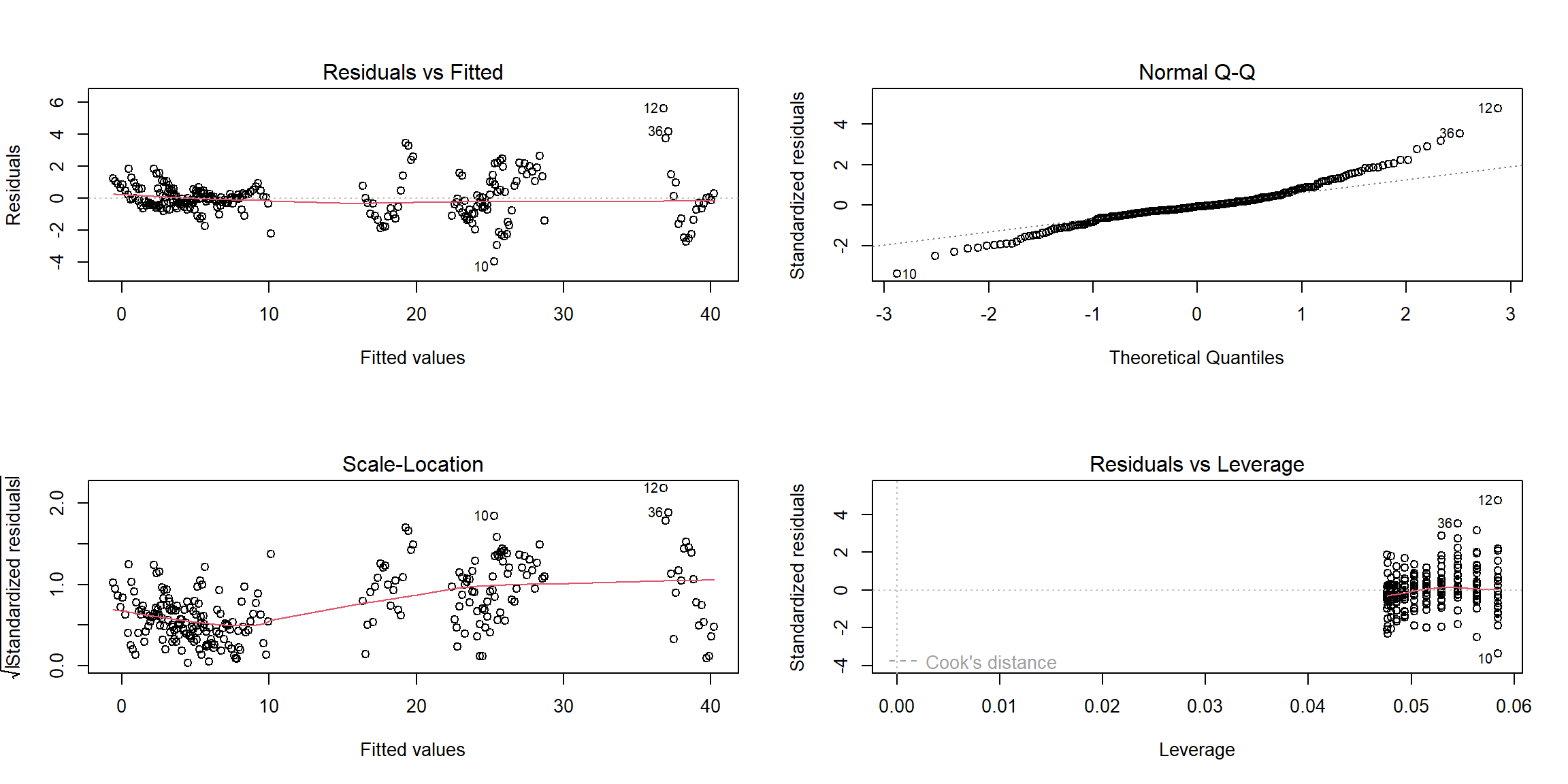
Results
sui_reg %>%
  summary() %>%
   broom::glance() %>% kbl(
    caption     = "Key Statistics for Model Performance"
    , col.names = c(
        "R-squared", "Adj. R-squared"
      , "Sigma", "F-statistic", "p-value", "df", "Residual df", "N")
      , digits    = c( 2, 2, 0, 2, 5, 0, 0, 0)
    ) %>%
  kable_paper("striped", full_width = F) %>%
column_spec(1, bold = T)| R-squared | Adj. R-squared | Sigma | F-statistic | p-value | df | Residual df | N |
|---|---|---|---|---|---|---|---|
| 0.99 | 0.99 | 1 | 1994.27 | 0 | 12 | 239 | 252 |
As F-statistic is 1994.27, df=12, and the p-value is much less than
0.05, so we reject the null hypothesis at the significance level of
0.05. Hence there is a significant relationship between the outcome
suicide rate and the variables (Year,
Sex, Age, and the interaction term
Sex*Age)in the linear regression model of the suicide
dataset.
sui_reg %>%
  summary() %>%
   broom::tidy() %>%
  kbl(
      caption     = "Effect of Selected Predictors on the US National Suicide Rate, 2000-2020"
    , col.names   = c("Predictor", "Estimate", "SE", "t-statistic", "p-value"),
     digits= 6) %>%
  # further map to a more professional-looking table
  kable_paper("striped", full_width = F) %>%
  # make variable names bold
column_spec(1, bold = T)| Predictor | Estimate | SE | t-statistic | p-value |
|---|---|---|---|---|
| (Intercept) | -345.151190 | 25.419955 | -13.577962 | 0.000000 |
| year | 0.172262 | 0.012646 | 13.621790 | 0.000000 |
| sexmale | 1.100000 | 0.375143 | 2.932218 | 0.003692 |
| age15-24 | 3.061905 | 0.375143 | 8.161975 | 0.000000 |
| age25-44 | 5.490476 | 0.375143 | 14.635704 | 0.000000 |
| age45-64 | 7.304762 | 0.375143 | 19.471960 | 0.000000 |
| age65-74 | 3.809524 | 0.375143 | 10.154868 | 0.000000 |
| age75+ | 2.819048 | 0.375143 | 7.514602 | 0.000000 |
| sexmale:age15-24 | 12.819048 | 0.530532 | 24.162638 | 0.000000 |
| sexmale:age25-44 | 16.452381 | 0.530532 | 31.011113 | 0.000000 |
| sexmale:age45-64 | 17.504762 | 0.530532 | 32.994747 | 0.000000 |
| sexmale:age65-74 | 18.485714 | 0.530532 | 34.843745 | 0.000000 |
| sexmale:age75+ | 33.490476 | 0.530532 | 63.126239 | 0.000000 |
According to the table, all the p-values are quite close to 0, so our
regression indicates that each predictor(Year,
Sex, Age) and the interaction term
(Sex*Age) have the statistically significant relationship
with the suicide rates.
The estimate for predictor Year is 0.17, which means
that when one year increases, the suicide rate will also increase 0.17,
assuming all other variables stay constant. This finding is not totally
consistent with the summary described in our previous visualization
process, probably because the suicide rate trend ripple is not enough
obvious or the variable Year is affected by other unknown
variables.
The estimate for predictor Sexmale is 1.10, which means
that when sex changes from male to female, the value of the suicide rate
will increase 1.10, assuming all other variables stay constant. Among
all the females, the predictor Age45-64 has the largest
value of the estimate, showing that the age group 45-64 has the higher
suicide rates than all other age groups. Among all the males, we need to
combine the estimates with age groups and the interaction terms, and
obtain that the age group 75+ has the higher suicide rates than all
other age groups. And these findings match with our summary from the
foregoing descriptive analyses.
Conclusion
Mental illnesses are common in the United States with a high level. Depression and anxiety are two of the most prevalent mental illnesses. In recent years, anxiety and depression trends have not shown apparent change and their associations with COVID-19 are not significant. Meanwhile, other factors like biological sex and household income appear to have larger effect on anxiety and depression. The study of mental illnesses are very important because they can increase risk of suicide. Suicide rates in the United States are generally high, increasing year by year before 2018, but has declined in recent years. Suicide rates vary by group, with male generally higher than females, elder people higher than younger people. Recently, firearm has become the leading means of suicide.
In our logistic regression modeling, we find no statistically significant association between COVID-19 status and taking medication for worried, nervous, or anxious feelings (aOR: 1.20, 95% CI: 0.96, 1.51),since p-value is larger than 0.05. Besides,we also find no statistically significant association between COVID-19 status and taking medication for depression (aOR: 1.13, 95% CI: 0.89, 1.45), due to p-value larger than 0.05. Hence, these two prevalent mental illnesses, anxiety and depression, are not significantly associated with COVID-19 exposure.
In our linear regression modeling, it show that each predictor (Year, Sex, and Age) and the interaction term (Sex*Age) have a statistically significant link with the suicide rates since all of the p-values are relatively near to 0. And the analyses indicates that in general, suicide rate in the United States gradually increases as the year progresses, and there indeed are group difference in the suicide rate by sex and age.
Next Steps
Although there is no significant association between ever having COVID-19 and anxiety and depression in our analysis of the overall U.S. population, it is still possible that the extensive impact of COVID-19 on economic and political environment exacerbates people’ anxiety and depression. In addition, the effects of COVID-19 on anxiety and depression in certain subgroups are also worth exploring. Further analyses can focus on subgroups or the extensive effects of COVID-19.
Because our existing dataset of suicides does not have information on data related to COVID-19, further exploration of whether COVID-19 exposure affects suicide rates in the United States could follow, if new data information is available.